ICA 2017
ICA’s economic impact was real and large — and abstract. Numbers alone would not move donors or entrepreneurs. The report had to carry two decades of economic data without flattening the people behind local business into decoration.

Challenge
ICA’s economic impact was real and large — and abstract. Numbers alone would not move donors or entrepreneurs. The report had to carry two decades of economic data without flattening the people behind local business into decoration.
Decision
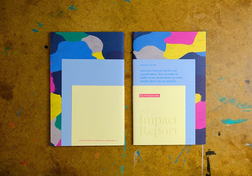
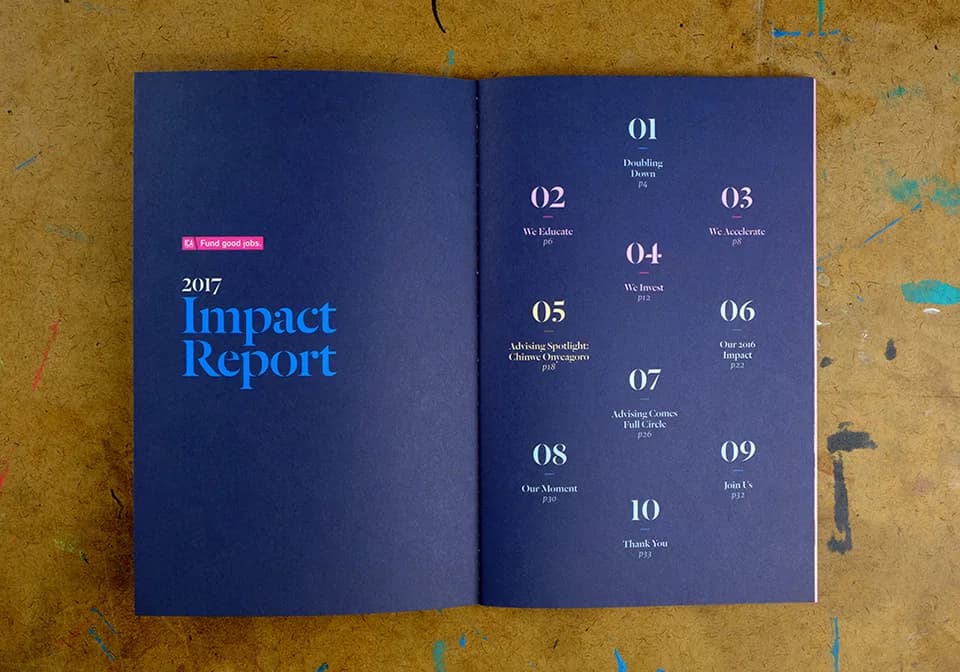
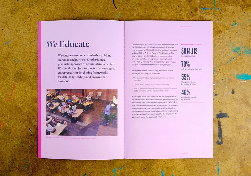
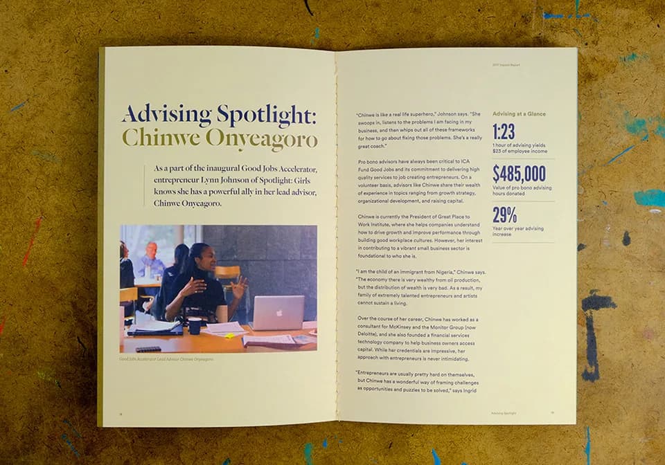
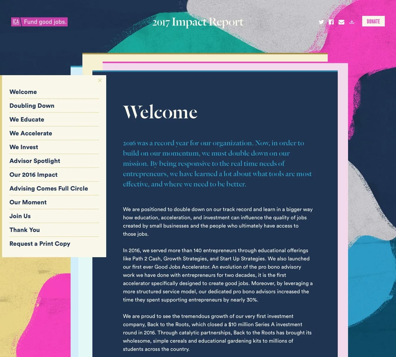
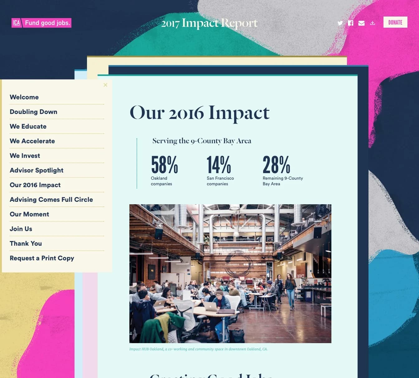
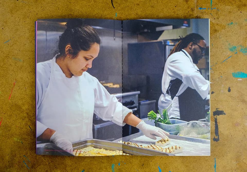
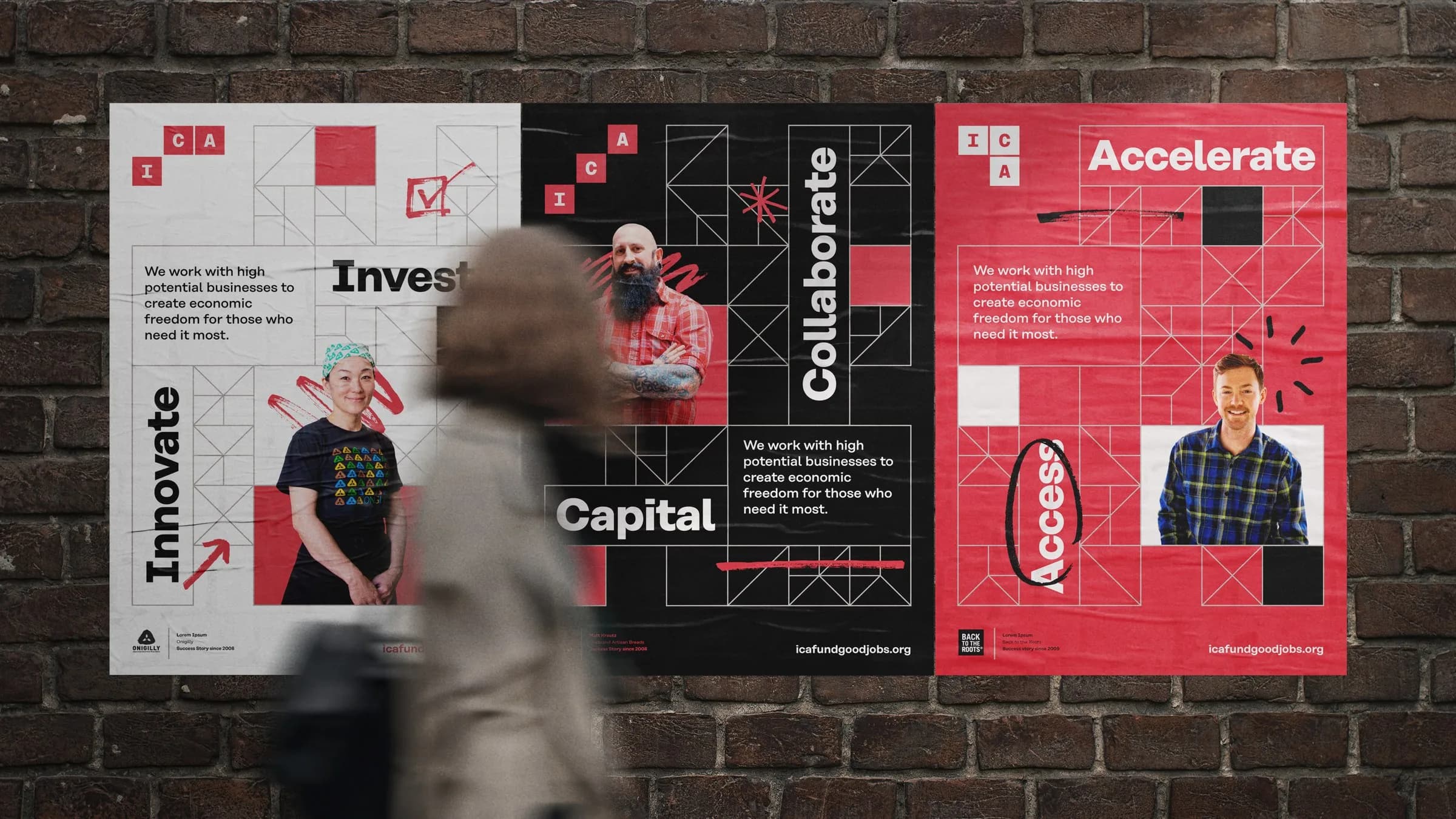
Rejected flashy infographics. Trend visualization would have looked like competence and felt like distance. Chose clarity and respect instead: an illustrative pattern system that tied stories together, color-coded by section; candid on-the-job portraits; data presented so readers could trust it. The experience goal was credibility, not spectacle.


Craft
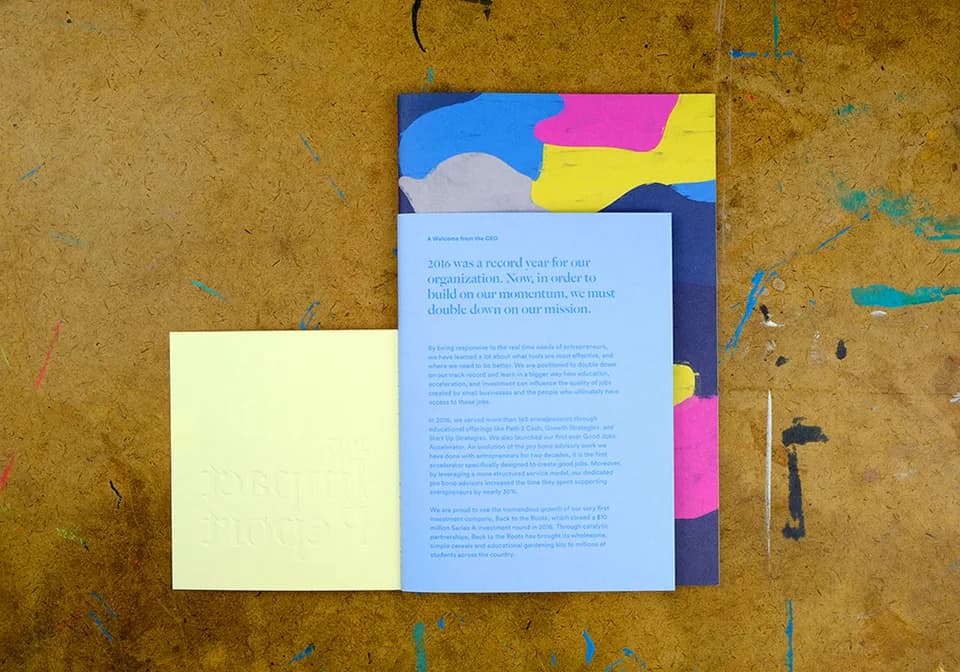
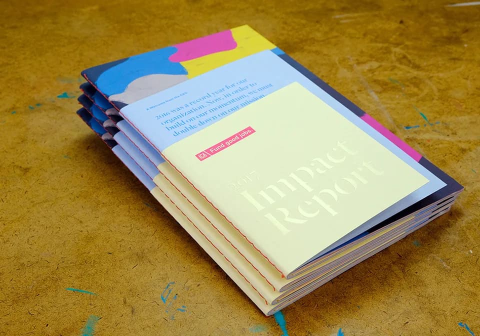
The print object was built to feel honest in the hand: uncoated stock, hand-stitched binding, blind-embossed title with clear foil, a welcome letter under the cover flap. The digital version translated that experience — paginated color-coded sections, a flyover menu drawn from the cover flap, the painterly cover held behind the scroll. Same decision. Different medium.
What held
The report introduced a new CEO’s vision and became a working object for the organization’s story — print and digital as one experience.
Reflection
Restraint was the decision that mattered. Trusting readers with real data built more credibility than any visualization fashion.