Great Place to Work
Great Place to Work was becoming a subscription analytics business. Its identity still belonged to an annual list announcement. Cold. Corporate. Built for a moment once a year — not for CHROs buying trust data, and not for the campaign volume the new model demanded. The organization had moved. The experience it produced had not.

Challenge
Great Place to Work was becoming a subscription analytics business. Its identity still belonged to an annual list announcement. Cold. Corporate. Built for a moment once a year — not for CHROs buying trust data, and not for the campaign volume the new model demanded. The organization had moved. The experience it produced had not.
Decision
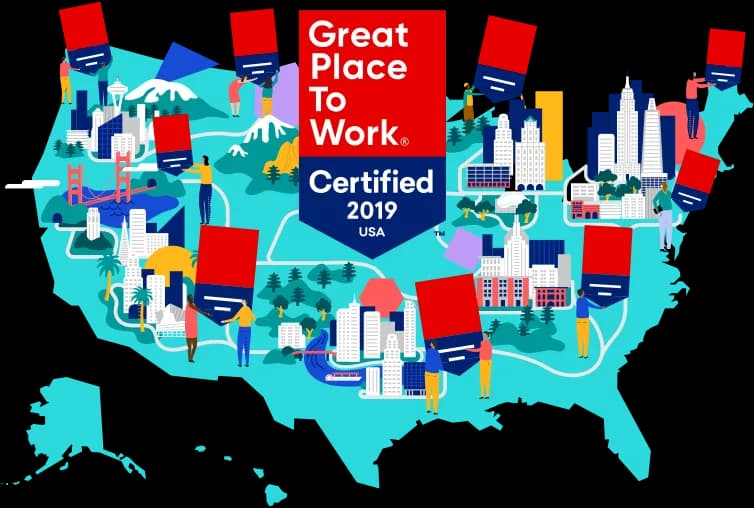
Rejected a louder, more expressive mark. A certification badge displayed by other companies is not a vanity identity — it is infrastructure. Designed for governance: badge architecture for certification years, country codes, and manager variants; a palette and type system (Sailec) a global licensee network could execute without a creative director in the room. Restraint over novelty. The decision: design for the organizations wearing the badge, not for the brand’s ego.


What shipped
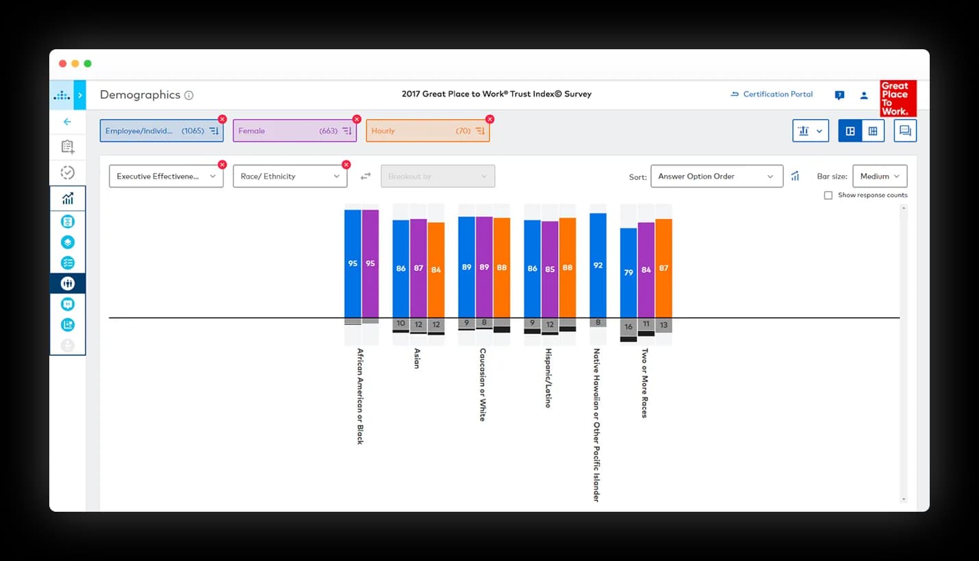
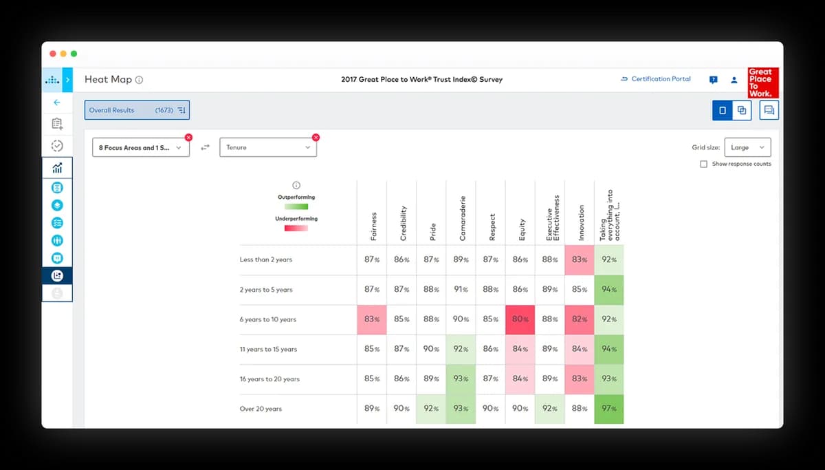
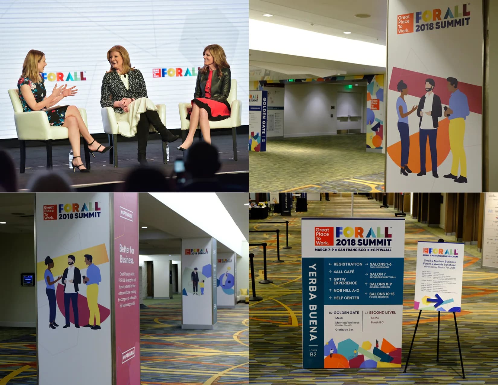
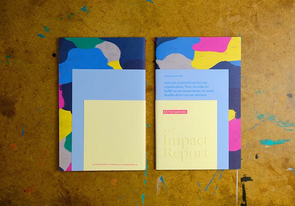
Identity system. Certification badge system. Guidelines. Environment, photography, and motion direction. Campaign work across print, digital, and live events — built so a lean internal team could keep producing without reinventing the system each cycle.
What held
The certification badge system is still in use across 10,000+ companies in 60 countries. That is the result that matters: a distributed credential still working years later.
Reflection
Designing a mark other companies choose to display is a different discipline than designing for a single brand owner. Governance is the craft. Expression is the temptation.